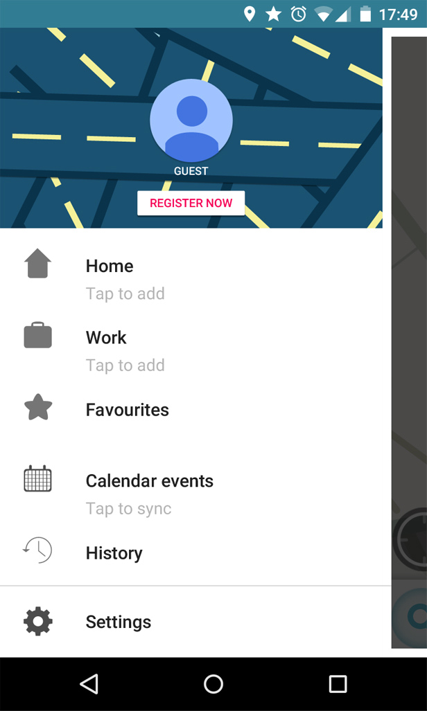
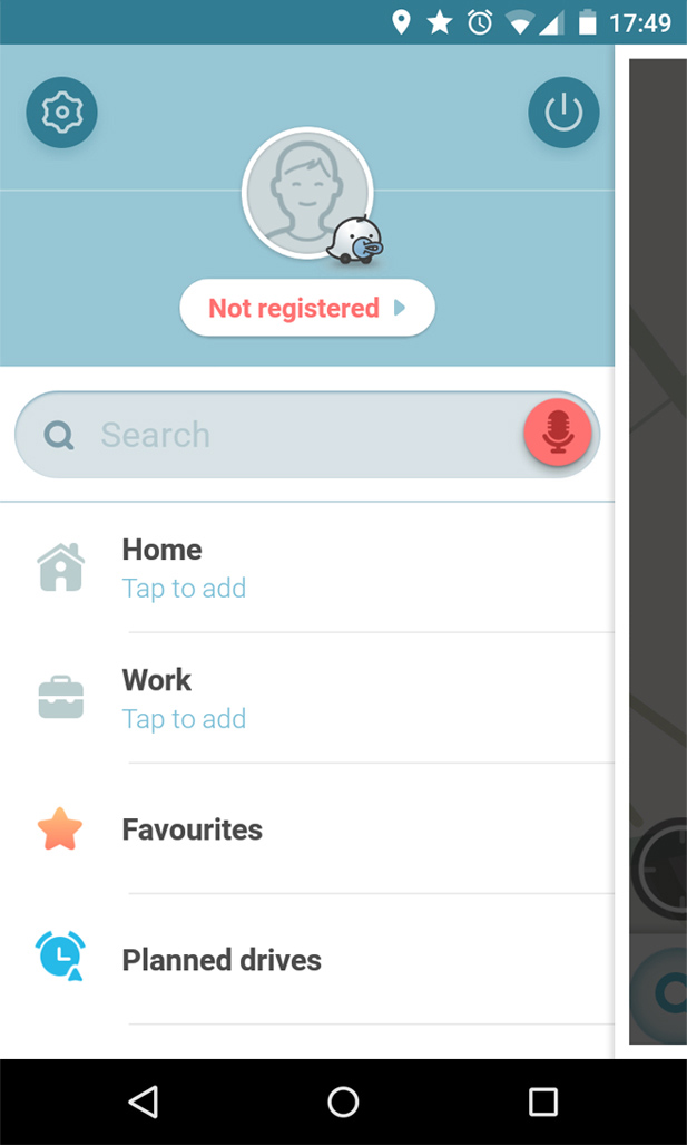
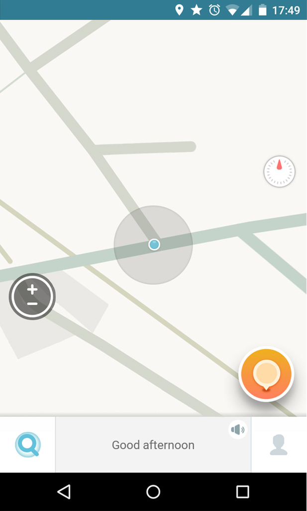
Waze is an amazing navigation app, suffering from an outdated UI. As a first time user lots of options and icons are unclear.
Issues
- -Outdated UI
- -Unclear icons
- -Bad alignment
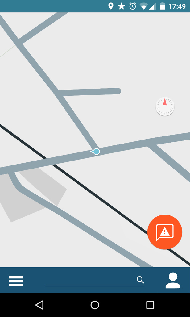
Changes
- -We update the UI to follow the material design guidelines by Google
- -The search bar is essential for every navigation app and gets moved to the main screen
- -The floating action button gets a new icon, a chat bubble for communication with a warning sign inside it
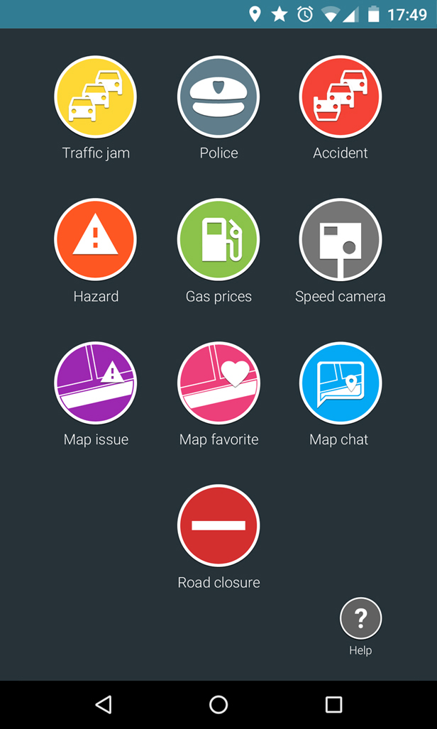
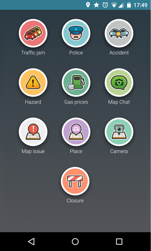
- -We add a small help button to the report screen, clarifying how it works
- -The settings button gets moved to the standard location